Showing posts with label inside my WALLS. Show all posts

Wednesday, November 25, 2015

a pumpkin MAKEOVER


I've had my pumpkins sitting on my door stoop for over a month now.  I set them out in time for Halloween.  Now that Thanksgiving is around the corner (literally- it's tomorrow) I thought it was time to glitz them up.  I've seen photos on Pinterest that gave me ideas, so none of this is ground breaking.  If you have 30 minutes to spare, you can add a bit o'gold to your Thanksgiving holiday.


Supplies: Pumpkins, gold acrylic paint and a paintbrush


Step 1: Pour a few drops of paint at the top of the pumpkin


Step 2:  Brush the paint downwards in straight lines.  Feather it out so the most paint is at the top, and more sparse about half way down the sides of the pumpkin.  My goal was to have a slight ombre effect.


Step 3: Place your pumpkins back on your stoop, or even decorate your Thanksgiving table.  You're done!


Have a wonderful Thanksgiving~


Tuesday, November 10, 2015

a bookcase with BOOKS?


Do you have a bookcase that you can't bare to look at?


Well, you've come to the right place.  There are so many great tips out there so you can style a beautiful bookcase.  I'm sure you've heard it's a great place to display special keepsakes like beautiful pottery you collected while on vacation.  Or maybe hang a large piece of artwork across the center divide for more of a gallery look, if that's your thing.


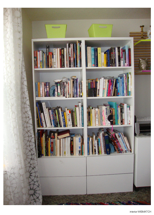
When my husband and I moved in, we were so desperate to unpack boxes so we could see the floor again, we just jammed all of our books into the bookcase.  I didn't categorize them in any way, because I knew I wanted to take care about the placement of each book.  I also figured that some books would tuck away inside a bin, or a box or two in the closet.


(It still pains me to see this photo...)


Before you know,  rainy October turned into boiling July.  I was so embarrassed that my bookcase, a feature on our main wall, was still a mess 9 months later.  Visitors were coming to visit from California so I needed to get on this- stat!

I gave my husband warning that I was going to tuck some of the books away so I can style the bookcase properly with some decorative items.  "What?!?  Why would you do that?  No, a bookcase is supposed to have books."  It was as if the thunders came crashing down on my design plan.  I do love him, so I decided to make it work.  I was really going to mix things up in the world, and design my entire bookcase with books.  That's right- JUST BOOKS.

As I mentioned my bookcase is on the main wall of our living space, so I wanted to create a color statement to enforce our color story.  I wrote a whole post about it, HERE, but to remind you my colors are neon yellow, grass green and navy blue.

Without accessories, my design was going to be about the color of the books.  Color blocking, or grouping like colors together, is a great way to make a big impact with just color.  It concentrates similar color for a bold statement.


Unfortunately I ran out of time before a best girlfriend of mine came to visit in June.  I thought we could do it together, but we were too busy touring Portland.

I'm not sure why, but I feel like I have so many books with a red or gold yellow spine.  This was our perfect color story for our Chicago apartment- but wasn't helping me at all in Portland.  I tried to neutralize this scenario by turning all of those books with the spine inwards.  Below you can see many books with the natural pages showing out.  I also tried to add some interest by stacking some books for contrast.


Alright, this was a start, but definitely not the answer!  You can also see I stacked piles of blue and green books for an attempt at color blocking.  I wish this would have looked better when my eldest niece came to visit.   I guess she'll just have to come back to enjoy it.  (My secret plan.)


I was not impressed with the lack luster of the colored spines turned inward.  There just wasn't enough COLOR.  Above you'll see I modified my concept.  Here the second and fourth rows are stacked.  This has a more united, graphic quality to me.  You can see more blue and green on the second row which is great.  However, you seen a ton of red, black and yellow which is not great.  I also categorized the bottom row with our favorite series, and religious books.


Here it is!!  Above is how it still stands today and it makes me SO HAPPY.  Do you see what remained consistent from the previous design?  The fourth row of books remains stacked by series- they just fit so well.  In the end I reinterpreted the rainbow display of books that is so popular in the design world right now.  I like to think of it as a MISMATCH rainbow.  

Row one is high in contrast with black and white across the top- easy peasy.  I knew I wanted blue to be on the right side, so I decided to start with the pink-red books.  Do you see the ombre effect?  Starting on the left: pink to red, green to blue.  Then snake down to the third row, starting on the right: navy to purple, orange to tan, capped of with grays on the far left.  

I'm happy to say I snuck in two pairs of accessories.  The blue agate bookend are just stunning, and are totally on trend this year (a bonus).  My husband has had them since he was a teenager, and he's happy to see them displayed in our home together.  I was also able to add in personalized brass bookend that I received as a  gift when I became Bat Mitzvah at 13 years old.  I'd call that a win-win for both us, don't you think?!


PS- my third visitor of the summer, a best friend from Chicago, finally got to enjoy the final result during his stay- PHEW!


Tuesday, November 3, 2015

front yard DIY


As you know from my last post, I placed two pumpkins on my door stoop last week.  The punch of color is beautiful, but I felt like it still needs something, but wasn't sure what.  I definitely do not have room for a third pumpkin....

Next I began collecting branches to fill the vase of my entry console.  I looked on our lawn, around the building on our side, and then near the parking lot.  I probably looked a bit silly picking up small twig branches, but I was on a mission!  I set them in the vase, only to find they were too short.  My next thought was to crumple some paper inside, and use that as a support to arrange the branches.  Instead, I found a piece of hemp and returned outside for a spontaneous DIY:


front yard DIY


Materials: Twigs, hemp string, and about 5-10 minutes of your time- SERIOUSLY


Gather the branches together so they meet in a central spot.  This is where you will tie them altogether.  Arrange them at different heights for interest and to keep a natural look.


Tie the twigs together with a strand of hemp.  I chose a simple knot.


Then use the second string of hemp to tie your bunch of twigs onto a post, tree, or rain gutter as seen here.


And that's it!  Here's is the full look~


 AFTER: My door stoop with my pumpkins and twigs.  (Click HERE to see the Before)


I have really enjoyed coming home this week.  It's just a little touch of Fall, but it makes me smile~


Tuesday, October 27, 2015

fall for FALL


"Because I Said So" is playing in the background, my candle is burning nearby, and I just put a fresh lemon and ginger tea bag in my oversized mug.  Now I can begin~

It's really Fall...hooray!  Up here in Portland, Oregon it really settled in this week.  It's cold enough that I should put socks on when I watch tv after dinner on the sofa, and it's cold enough that I need to put a jacket on when I walk outside.  I love it ALL.

Almost on cue, Parachute contacted me recently and asked me how I prepare my home for the cozy Fall season.  Grab your favorite throw, and let's get started:


1. Slow cooked oatmeal drizzled with honey and a few taps of cinnamon

2. Enjoy the flickering light of the scented candle I purchased during Summer

3.  Stage pumpkins on my door stoop to welcome us home everyday, and take a slow breath


4.  Rotate out my high heels for sexy ankle boots

5.  BOOTS- all are welcome!

6.  Adorn the empty coat rack with a rain jacket, or two- seriously...

7.  Stash my gloves in my coat pockets, and my umbrella in the car door


8. Dive into my drawers of scarves, and pull the perfect one for my outfit

9. Unleash my love of light-knit sweaters  

10. Snuggle up in a cashmere throw, that's been rolled up in a felt bin, for a weekend nap on the sofa... (Parachute has a beautiful collection)


This is how I prep and infuse my home with natural elements, spiced scents and knit textures for a completely cozy Fall season.  

I'd love to know how you transform your home, so I hope you'll leave a comment below~


Monday, May 4, 2015

mismatch BAY WINDOW


I love having a large bay window in my living room.  It allows a lot of light to shine in, and good air circulation on those warm days.  Here's an elevation I drew so you can see it:


Hmm, do you notice anything a bit odd?  The large center window of this trio is not centered on the wall- it drives me crazy!  How does someone take the time to add this great feature to a home, and then not execute it with precision?  Well, this is proof that is happens not just in my town home, but in the entire complex.  Anyhoo....

I certainly planned to dress these windows from the moment we moved in.  There are mini metal blinds on all of our windows.  As unattractive as they are, they do provide light control and privacy.  I live on the end unit in a row of townhouses, but I do have neighbors across the way so privacy is a concern.  

So I really only needed a decorative element to soften the hard lines of the mini blinds, and add some luxury to feel like more like a home instead of a rental.  My plan was to hang stationary fabric panels to add a pattern and visual interest to this otherwise unadorned wall.  I was going to hang a pair on the center wall, and a pair framing the small side windows for a cohesive design.  Hanging a pair of fabric panels on the center wall that overlap the window edges would create the illusion that the large window is centered.    Perfect!

However, if you read my blog, you already know that this plan went out the WINDOW (haha).  Click here to read about it.  The gist of it is that I found sheer panels at a steal of a deal and went with it.  Here's the new plan:


I'm really excited about these new window treatments!  Creating a wall of sheers also disguises the un-centered window- my nemesis... By creating a fluid or continuous window treatment it makes the wall feel like one large window instead of 3 smaller windows.  Another benefit is that sheers with 2x fullness also filters light and blurs the view from our close-by neighbors .  I think I will pull the mini blinds up during the day, and just lower them in the evening for complete privacy.

However, my last thought is to use washi tape and create a faux molding around each window for some added detail.  In this case I would evenly space the molding on the large window so it looks centered.  I know this is a bit out-of-the-box, but that's my style:


There's so much to say about window treatments, that I think I'll save more of my tips for another post.  I went and bought drapery rods last week, and I can't wait to install them!

So, what do you think of my ideas to unite my mismatch bay window?


Sunday, April 26, 2015

my neon COLOR STORY


The hardest part about being an interior designer is having the time to design your own place.  I've been in Portland for 6 months and not one thing is hanging on the wall- so EMBARRASSING.  

I knew that I wanted to experiment with neon colors in a fun yet sophisticated way.  I pictured hot pink and highlighter yellow.  Finally, one day I came home after some speed walking on a nature trail and took a look at myself in the mirror and BAM.  I saw my color story: My yellow-green long sleeve shirt, and neon yellow straps from my grey sports top.  I was instantly energized by this combo.  I knew I wanted another color one more color, but wasn't sure what.  Then a few weeks later I just thought, navy blue OF COURSE.  What a great shade to ground these brighter colors with, right?  I really want the highlighter yellow to shine, but I'll have to use it in key accents so it is not overwhelming.


I love this MISMATCH of neutrals and neon.  The funny thing is now that I've made this inspiration board, I see that I've actually created an analogous color scheme.  Seriously?!  I never even thought about that when putting this together.  Generally, an analogous color scheme is calming because three colors are adjacent to each other on the color wheel.  However, since I've mismatched the hue, or intensity, of these colors there is a lot of contrast.  Portland has many gloomy days, so I wanted a color story with lots of energy, and that's exactly what contrast creates.

I can't wait to get some artwork up on the walls, and I hope to have some ideas to share with you soon.


--------------------
SOURCES

Plant: Divine Caroline
Artwork: Wit & Delight
Sofa: West Elm
End table: Target


Sunday, April 5, 2015

in my BED


Today has been a lazy day...and it feels so good just to relax in bed!   While I'm in here, I figured I better jump on the chance to get in on the bedding sale at West Elm before it ends tomorrow night.


I have been eyeing this bed set by Kate Spade for West Elm for several months.  It's called the Floral Duvet Combo/ Habanero.  The colors are so rich and bold.  I think this will help wake me up in the mornings and get my day started with more energy.


I used my Design Dollars to purchase the duvet and matching standard shams.


Continuing with my energy concept, I added these playful Dot Sheets/Pool.   This will be a real mix-up from the standard white sheets I've been using for the last several years.


The small polka dot pattern will balance with the large splotchy-floral pattern.  So, what should I put on the windows?


This wavy curtain has a lot of energy to it, but I'm not sure if it's too busy with the duvet...


I had zigzag drapery in my last apartment, but it was multicolored and a smaller scale.  This has high contrast and sharp lines which may balance well with my bedding.


Well, this is something different.  This block print design is great, but might compete for attention...


I'm just glad knowing that some new bedding is on the way.  My last bedroom was very neutral with grey, cream, and wood tones.  It was so peaceful to end each day with, but now I want something energizing to pump me up in the mornings.


--------------------
SOURCES

Images: West Elm


Wednesday, March 25, 2015

sheers by SURPRISE


Yesterday I went to my local West Elm to look for new bedding.  I was on the search for Kate Spade Saturday Floral Duvet Cover + Shams.  I was a bit sad when I couldn't find them in the store, so I kept looking around for some more design inspiration.

Not only did I find some inspiration, but I found a great deal.  I was scoping the sale section, as you should know is my new favorite past time, and found some geometric sheers.


by ME


I think these would look pretty cool in my living room.  I showed them to my husband, and he agreed without hesitation- YES.  However, I couldn't find the tag with the name of the sheer.  Everything else was tagged, so I figured they must be out of stock already...

I found a cool lamp and pendant, but came back over to the drapery section.  I looked through all the packages and finally found two on the bottom row, marked at 50% off.  They did not have more in the back, but said I could buy these two for 75%  off.  What a steal, but I need more than two for my bay window.  I asked if they could check their Seattle location.  Looks like they should have 14 in the system, but turns out they had none....But then we found seven in California- put those babies on HOLD!


I bought the last two in Portland to take home and confirm they were going to work in our living room.  Of course, this idea was totally out of the blue.  I had been planning to use decorative panels in between and on the outside of the bay window.  I could picture these in my design right away.  I like the Moroccan, geometric, and feminine feel they bring to our space.  Sheers will filter the light in our space and cover our builder grade metal blinds.

When I got home I learned that my ceilings aren't quite 8 feet tall, so I'll need to hem them a bit.  The panels are 48"W, and sheers should be about 2x-3x fullness.  This makes the sheers look more luxurious, and not as if you hung a sheet up on the wall (very college-esque).  As a discontinued item there is only a limited amount available, so mine will be about 2x fullness. That means 1 panel per 24 linear inches.  


(PS....You can still find the Rosette Tile Burnout Curtain online in the 84"L)


Sunday, March 15, 2015

dining table FLIP

As you saw in my last post, I found a new round, pedestal table last week which is perfect for our dining space.  So what do I do with the one we already found at the thrift store?  Flip it, of course!

Did you ever see the show Flea Market Flip? It used to be on HGTV a while back.  The premise of the show is that two teams each have one hour to find three items at a flea market for the best deal they can.  Then they have one day to "flip" their items, which means to give them a makeover.  Then they return to a flea market to sell their "flips" with the goal to make the highest profit, and win the ultimate prize of the show.  It never gets old!

Some flips turn out better than others, but it is just so much fun to watch.  It really gets our wheels turning!  This extra dining table of ours is the perfect opportunity to get our feet wet in this business.


This is the dining set I bought.  It wasn't sold as a set, but I pulled it together to be so.  You can see it can be used as a dining table or as a console.  The leaves fold down on either side, which makes it multifunctional.  I want to spruce it up, but I'm debating how creative I want to get.


1. Refinish the wood top, and paint the base navy blue:  Navy is a great neutral, and is something a little different but not distracting.

2.  Refinish the wood top and paint the base black: This is such a classic combination, and adds some sophistication.

3.  Paint the top Kelly Green, and the base charcoal grey.  The pop of Kelly Green is energizing.

4.  Paint the whole table a tone of teal.  It's a burst of color, but with some grey in it still makes it more livable.  On the other hand, maybe going bright teal is the way to go with a bold statement?

5.  Paint the whole table charcoal grey.  It is a soft and modern neutral.  It will go with any decor you have.

6.  Paint the whole table mint.  This color is everywhere these days, and pastels are still popular this year.  (Plus, it was my wedding color in 2012 <3  )


My husband and I both have the day off on Tuesday, so that's our day to get this flip flopped. (Sorry, I couldn't resist.)

I am going to post it for sale on Craigslist.  I'd like to make top dollar for it- especially because our new table cost a bit more than expected!  Which option do you think will do best in Portland?


*** visit "dining table FLIP: Part 2" to see which color I painted the table***


--------------------
SOURCES

Photos: my HUSBAND
Drawings: by ME


Thursday, March 12, 2015

time for TABLES

If you read my post 'dilemma of a RAG RUG' you'll know I was debating between the display rug and the one I actually brought home.  But I couldn't get a realistic feel for the rug without a coffee table, so I borrowed my nightstands to act as small coffee tables or ottomans.  (They were actually end tables in my last apartment).  After persuading my husband, I mean explaining to him why I like the two small tables instead of a large coffee table, he is totally on board.  So, now I'll explain it to you.


My reasoning is for flexibility and to break the space up a bit.  There are several large rectangles in our living space already.  The sofa console, sofa, media units, end table, and even the dining table.  It is starting to look like blocks and obstacles to move around.  I was also thinking about where to put the large coffee table when I do my workout videos, or when we extend the sleeper sofa.  I just had a feeling I was going to dread lifting that thing every time.  Plus, I can only use that as an excuse for not exercising for so long!


Do you see how the small square tables make the space feel a bit lighter?  If not, just take my word for it, it makes a difference.  They can even double as extra seating if you really think about it, right?

Did you notice the other improvement?  It's big and round....Yup, it's the new round pedestal dining table.  We went to IKEA for a walk (I know you're smirking at that) and ended up at the famous 'As Is' section.  After stalking the Ingatorp Extendable Table for an hour until closing, my husband went back the next morning and bought it for an excellent discount- ALRIGHT!


(View towards stairs)

I initially wanted a round pedestal table to keep the flow smooth and improve circulation in our small space.  Not only will it sit four people easily, but it opens up and has a butterfly hinge system with a leaf in the center.  It's a great investment piece, and will have longevity over the years.


(View towards kitchen)

Lastly, we moved our end table across the room, next to the door.  I didn't want two black tables next to each other, plus it was getting a bit snug.  Now it serves as the drop-off zone for my husband's stuff when he walks in the door, instead of just a pile on the floor- much better!  It also looks brighter with the side of the light grey sofa fully exposed.

Remember to 'missmatch' the shapes in your space.  It's good to have repetition, but a space also needs accents for variety.  There are several rectangles, a pair of squares, and two circles in different sizes.  Variety keeps the eye moving around the space, and keeps it interesting.


--------------------
SOURCES

Drawings: by ME

Sunday, March 8, 2015

apartment therapy TRENDS


I subscribe to Apartment Therapy and read this great article today that really resonated with my design style for my Portland townhouse.

The article, 9 Colorful Trends to Brighten Up Your Home touches on most of the ideas that I love right now.  In my opinion they are not strictly trends.  Depending how you use these so-called trends, that can have a timeless appeal.


I especially love the bold artwork, Moroccan rag rugs, indoor plants (but not so large), and a colorful bedspread focal point.  Have you seen the rug I'm thinking to use in my living space?  See it here.

What's your favorite trend that you can use in your home?


Thursday, March 5, 2015

dilemma of a RAG RUG

Two nights ago I went grocery shopping with my husband at a mega store.  It had all of the amenities of a Wal-mart, but fancier.  We went to the home area to buy some small trash bins for the kitchen, then made our way to the grocery section.  But then I pulled over because something gorgeous caught my eye...


WOW......Aren't the colors just amazing? I just love how bright it is, and I love the texture.  I have been looking for a super colorful rug and this might just be it.  Or is it a bit too crazy?  Okay, back to the grocery list!


So, this rug totally reminds me of this image I found on Pinterest.  It's just a mish-mash of colors, but more modern in a geometric pattern:


My husband surprised me the next day.  When I came home from work, he had the rug sitting in the back of his car.  As he carried it inside, I thought it looked a bit red/purple heavy, but who can really tell from the outside of the roll, right?


Apparently, I could!  This was definitely not the same coloring as the display rug- shoot....My excitement plummeted...You can see in the photo it is very heavy on the red, magenta, purple colors on the right half of the rug.  Then totally opposite, the left 1/4th of the rug is super neutral with grey, green and blue.  So random...  I decided to leave it out for the night and see how I felt the next day.

When I came down the stairs this morning, it wasn't so awful anymore.  From going to a white room, to plopping down this mega colorful rug was a bit shocking last night.  I kept it out to give myself time to adjust, and I'm still adjusting.  It is also stealing all of the attention in the room because I do not have any other accessories, or pieces for it to make sense with yet.  


See our "lovely" brown carpet?  Well, that's exactly why I want to add color with a rug in our living space!


And here comes the color... It's a lot to take in, but it may work.  I'm thinking that having these rich colors grounding the space will allow me to experiment with some neon up on the walls.  It may create the balance I need to work with such bright colors around the room.


I brought down our night tables to help me envision a coffee table or ottomans on top of the rug.  (I'm not sure what color our "coffee table" will be yet.)  At this point in time, I'm staring intensely at the rug because it's the only thing to look at so far.  In real life, the rug will be a supporting player and not the main attraction.  A gallery wall, drapery, and soft accessories will really bring everything together.


But again, the multi-colors of the display rug is what I originally fell in love with.  I'm going to head back to the store and ask if they will sell their display.  The nature of the handmade rag rugs is that each of them are so different, and that's the beauty of them.  The key is to find the right one for your design aesthetic and scheme.  


Hmm....I'm not sure how I feel about the colors, or the overall weave yet.  I have to admit that it is very cushy under my feet, which is an added selling point.  I'll let you know what I decide.  Any thoughts?


-------------------
SOURCES

Photography: by ME


Related Posts Plugin for WordPress, Blogger...