Wednesday, November 25, 2015

a pumpkin MAKEOVER


I've had my pumpkins sitting on my door stoop for over a month now.  I set them out in time for Halloween.  Now that Thanksgiving is around the corner (literally- it's tomorrow) I thought it was time to glitz them up.  I've seen photos on Pinterest that gave me ideas, so none of this is ground breaking.  If you have 30 minutes to spare, you can add a bit o'gold to your Thanksgiving holiday.


Supplies: Pumpkins, gold acrylic paint and a paintbrush


Step 1: Pour a few drops of paint at the top of the pumpkin


Step 2:  Brush the paint downwards in straight lines.  Feather it out so the most paint is at the top, and more sparse about half way down the sides of the pumpkin.  My goal was to have a slight ombre effect.


Step 3: Place your pumpkins back on your stoop, or even decorate your Thanksgiving table.  You're done!


Have a wonderful Thanksgiving~


Monday, November 16, 2015

inspired by turning LEAVES


I cannot help but notice the trees shifting in color.  The colors are changing from green to the most vibrant red, orange and yellow.  These harvest colors are intwined in the typical color story we think of for autumn.  However, I have been most intrigued by the in-between phase of these colors: green, yellow and orange.  It is a bit odd, but there is something atypical that I have grown fond of  during my drive to work last week.


autumn fall trees
Hood River, Oregon: Traveling Mom


I took a closer look at this trio, and realized they create an analogous color scheme.  This means they are three colors adjacent on the wheel: orange, yellow, green.  Mother Nature really knows what she's doing- Imagine that!


color wheel


So, here is my Mismatch Map to help you create a living room inspired by this leaf-turning color story:

My design begins with the sofa pillows (3).  Solid green velvet and a large-scaled yellow ikat pillows started things off with a punch of color.  The black and white geometric was the perfect modern touch  for some contrast.  Next I selected a light grey sofa (2) to be the perfect neutral backdrop for the pillows.  Are you trying to get cozy in that oversized Tulip Chair (8)?  I was a Home Stylist at West Elm Chicago a few years ago, and knew that was going to be the perfect chair- no search necessary! The orangey, cognac color leather has so much warmth to balance out the cool tone sofa.


interior design west elm pottery barn sofa chair


Time for a coffee table....  My first thought was a raw edge design, then a marble top round, but in the end I loved the natural wood tones of this carved table (6).  To balance, I wanted something crisp and white for the end table, and this papier-mache table (7) fit the bill to a T.   Then I started my search for a rug to pull the design altogether.  My luck was fading quickly for a green rug, and I felt that yellow or orange would disguise the beautiful wood work of the coffee table.  I'm so happy with the hand-drawn design of this rug (5).  It feels modern and ethnic at the same time, and really lets everything else in the room shine.  

Just a few last details...I was hoping for patterned drapery, but it felt too busy.   A pair of linen drapery panels (4) on an iron rod soften and frame the window nicely.  The industrial style of the adjustable floor lamp (1) ties in with the drapery rod, and reminds me of the lines in the rug.  And there you have it!

The warm golden tones are repeated three times in this design: pillow, coffee table and chair.  White and natural linen keep the room feeling light and bright for a modern twist on this season.  The balance of warm and cool tones give this MISMATCH autumn room longevity all year long.  


SOURCES

I kept my sources easy for this living room.  You can find all of these furnishings at West Elm and Pottery Barn.  

1. Chelsea Sectional Floor Lamp
2. Heath Sofa
3. Washed Velvet Lumbar Pillow, Yara Ikat Pillow, Dearsley Embroidered Pillow
4. Belgian Flax Linen Drape
5. Torres Wool Kilim 
6. Carved Wood Coffee Table
7. Papier-Mache Drum Side Table
8. Tulip Leather Chair


Tuesday, November 10, 2015

a bookcase with BOOKS?


Do you have a bookcase that you can't bare to look at?


Well, you've come to the right place.  There are so many great tips out there so you can style a beautiful bookcase.  I'm sure you've heard it's a great place to display special keepsakes like beautiful pottery you collected while on vacation.  Or maybe hang a large piece of artwork across the center divide for more of a gallery look, if that's your thing.


When my husband and I moved in, we were so desperate to unpack boxes so we could see the floor again, we just jammed all of our books into the bookcase.  I didn't categorize them in any way, because I knew I wanted to take care about the placement of each book.  I also figured that some books would tuck away inside a bin, or a box or two in the closet.


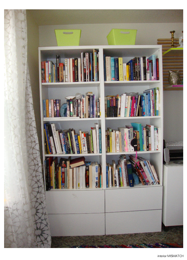
(It still pains me to see this photo...)


Before you know,  rainy October turned into boiling July.  I was so embarrassed that my bookcase, a feature on our main wall, was still a mess 9 months later.  Visitors were coming to visit from California so I needed to get on this- stat!

I gave my husband warning that I was going to tuck some of the books away so I can style the bookcase properly with some decorative items.  "What?!?  Why would you do that?  No, a bookcase is supposed to have books."  It was as if the thunders came crashing down on my design plan.  I do love him, so I decided to make it work.  I was really going to mix things up in the world, and design my entire bookcase with books.  That's right- JUST BOOKS.

As I mentioned my bookcase is on the main wall of our living space, so I wanted to create a color statement to enforce our color story.  I wrote a whole post about it, HERE, but to remind you my colors are neon yellow, grass green and navy blue.

Without accessories, my design was going to be about the color of the books.  Color blocking, or grouping like colors together, is a great way to make a big impact with just color.  It concentrates similar color for a bold statement.


Unfortunately I ran out of time before a best girlfriend of mine came to visit in June.  I thought we could do it together, but we were too busy touring Portland.

I'm not sure why, but I feel like I have so many books with a red or gold yellow spine.  This was our perfect color story for our Chicago apartment- but wasn't helping me at all in Portland.  I tried to neutralize this scenario by turning all of those books with the spine inwards.  Below you can see many books with the natural pages showing out.  I also tried to add some interest by stacking some books for contrast.


Alright, this was a start, but definitely not the answer!  You can also see I stacked piles of blue and green books for an attempt at color blocking.  I wish this would have looked better when my eldest niece came to visit.   I guess she'll just have to come back to enjoy it.  (My secret plan.)


I was not impressed with the lack luster of the colored spines turned inward.  There just wasn't enough COLOR.  Above you'll see I modified my concept.  Here the second and fourth rows are stacked.  This has a more united, graphic quality to me.  You can see more blue and green on the second row which is great.  However, you seen a ton of red, black and yellow which is not great.  I also categorized the bottom row with our favorite series, and religious books.


Here it is!!  Above is how it still stands today and it makes me SO HAPPY.  Do you see what remained consistent from the previous design?  The fourth row of books remains stacked by series- they just fit so well.  In the end I reinterpreted the rainbow display of books that is so popular in the design world right now.  I like to think of it as a MISMATCH rainbow.  

Row one is high in contrast with black and white across the top- easy peasy.  I knew I wanted blue to be on the right side, so I decided to start with the pink-red books.  Do you see the ombre effect?  Starting on the left: pink to red, green to blue.  Then snake down to the third row, starting on the right: navy to purple, orange to tan, capped of with grays on the far left.  

I'm happy to say I snuck in two pairs of accessories.  The blue agate bookend are just stunning, and are totally on trend this year (a bonus).  My husband has had them since he was a teenager, and he's happy to see them displayed in our home together.  I was also able to add in personalized brass bookend that I received as a  gift when I became Bat Mitzvah at 13 years old.  I'd call that a win-win for both us, don't you think?!


PS- my third visitor of the summer, a best friend from Chicago, finally got to enjoy the final result during his stay- PHEW!


Tuesday, November 3, 2015

front yard DIY


As you know from my last post, I placed two pumpkins on my door stoop last week.  The punch of color is beautiful, but I felt like it still needs something, but wasn't sure what.  I definitely do not have room for a third pumpkin....

Next I began collecting branches to fill the vase of my entry console.  I looked on our lawn, around the building on our side, and then near the parking lot.  I probably looked a bit silly picking up small twig branches, but I was on a mission!  I set them in the vase, only to find they were too short.  My next thought was to crumple some paper inside, and use that as a support to arrange the branches.  Instead, I found a piece of hemp and returned outside for a spontaneous DIY:


front yard DIY


Materials: Twigs, hemp string, and about 5-10 minutes of your time- SERIOUSLY


Gather the branches together so they meet in a central spot.  This is where you will tie them altogether.  Arrange them at different heights for interest and to keep a natural look.


Tie the twigs together with a strand of hemp.  I chose a simple knot.


Then use the second string of hemp to tie your bunch of twigs onto a post, tree, or rain gutter as seen here.


And that's it!  Here's is the full look~


 AFTER: My door stoop with my pumpkins and twigs.  (Click HERE to see the Before)


I have really enjoyed coming home this week.  It's just a little touch of Fall, but it makes me smile~


Related Posts Plugin for WordPress, Blogger...