Sunday, December 28, 2014

2014: my TOP 5

With 2015 just around the corner, I thought it would be fun to take a moment and recap my top 5 most popular posts of 2014.  (This was a great idea I saw on Apartment Therapy)

Here we go...  (feel free to enjoy with a glass of champagne!)


#5 - just one, PLEASE

I created this post shortly after I re-did my blog format.  This room was inspired by a room in a House Beautiful magazine.  I love how fresh and crisp the monochromatic palette is.  Click on the link to read the full post~


#4 - A Sneak Peak

This post now holds a special place in my heart.  This was my apartment in Chicago, the first home I lived in with my husband.  The zigzag drapery fabric I found was the inspiration for the living space (I made these drapery panels by hand with my friend!)


#4 (again) - Mustard for EVERYONE

This post tied for the #4 spot in this countdown.  In this post I shared how to create interest and variety in a pillow collection just featuring one color- mustard.  The key is pattern, scale and shapes.


#3 - one print does ALL OF THIS

I still LOVE this collection.  This was my first collection that I created.  The idea is to show you how to create a modern and eclectic design.  From traditional tufting to mid-century modern lighting, and from geometric prints to deco glamour.


#2 - washi my WALL

This was my last DIY before moving from Chicago to Portland.  I wanted to share my first project using Washi tape (Don't worry, more DIYs to come for my Portland townhouse!).  I was really happy how my feature wall turned out.  It's just a shame I only got to enjoy it for about 2 weeks...


#1 - Time to Change

The title of this post feels so appropriate at this time of year when we are making our New Year's Resolutions, don't you think?  I took a blogging e-course this summer from Blogging Your Way.  This post is full of before and after images of my blog design and my Pinterest boards.


I am still energized about the new direction and perspective for my blog.  I hope you'll stay tuned, and refer your friends here, in 2015 for more ideas on how to 'missmatch' your interiors!!


Wednesday, December 24, 2014

light in 1,2,3

It's all about lighting, because we'd be lost without it~

Lighting adds drama, function, sparkle, a mood, and even color.  There are three layers of light: ambient, task, and accent.


1- Ambient light casts an overall glow in a room.  A floor lamp, ceiling pendant or table lamp are good examples.  When you come home in the evening and walk in the door, you automatically flip on the foyer light hanging above so you can see the room when you walk in.  The floor lamp in your living room, or a pair of table lamps don't serve a specific purpose, but provide light to the entire space.  Ambient lights glow in the room, and usually have a light colored shade to cast a soft light.


     Foyer ceiling lantern, ambient light: Heather Bullard


    Floor lamp, ambient light: Better Homes and Gardens


Table lamps, ambient light: Popsugar


2- Task lighting is lighting for the purpose of a task (just as it is labeled).  A desk lamp or under-cabinet lighting are perfect examples.  A desk lamp directs light down at your desk to write a letter, etc.  Under-cabinet lights on your kitchen cabinets are there to focus light at your countertops when you are preparing food.  When chopping carrots with a sharp knife, you should have optimal lighting for safety.  A series of small pendant lights over your kitchen island is fashionable, but it's main purpose is to light the task you are doing at the island.


      Desk lamp, task lighting: The Design Files


            Kitchen island pendant, task lighting: Apartment Therapy


3- Accent lighting adds the drama!  Wall washers and cove lighting direct light to highlight architectural details such as arched arched hallways, recessed ceilings, and brick exteriors.  Xenon strips tucked in a soffit highlights a recessed ceiling, and upward wall sconces highlight an arched hallway.  Light bounces off these surfaces and makes that element even more beautiful.  Exterior lighting also falls into this category.  For an instant example, think of Sleeping Beauty's castle at Disneyland.  It is washed in lavender uplighting which showcases all of the turrets and architecture of the castle.


   Cove lighting in soffit, accent lighting: Culthomes.com


     Recessed lighting, accent lighting: Arch Daily


                     Color wash of uplighting, accent lighting: Disney Tourist Blog.com


In theory, each room should have a light source from each of the 3 layers of lighting.  Don't fret about it, because it's easy as 1, 2, 3!  Let's take the bedroom for example.  1- A ceiling lamp such as a surface mounted fixture or even recessed lighting is your ambient layer.  2- Bedside table lamps  to read in bed are your task layer.  3- Lastly, a picture light over a piece of artwork is your accent layer.

Remember to 'missmatch' the style of your lighting for an extra LAYER of design! (Check out my previous post "mix-up your LIGHTS"for ideas)


Monday, December 22, 2014

holiday card DIY

I just wanted to share with you my 2014 holiday card DIY with you.

You can make this sort of card for any occasion (Birthday, Congratulations, holidays) with the right stamp or personal message inserted in the message area of the card.


I chose a neon color palette this year, which is definitely not the norm for holiday cards!


Step 1:  Make your abstract and linear design with Washi tape.  I chose three colors for balance even though the design in asymmetrical.  After I stuck down a piece of tape, I flipped the card over, and used the card edge as my guide to cut the tape off of the roll.


Step 2: I stamped my rubber stamp with white ink to pop on my black card.


Step 3: Next, use neon gel pens to address your recipient and sign your name.  (The gel pens were a little difficult for me to use.  The flow of gel got stopped up if I changed the angle of the pen.)


Step 4: Lastly I used a little stamp on the back side of the envelope.  This one adds a little humor!


These were one of the easiest cards to make in mass.  Family, in case you're wondering, YES, I really did make these, and you will have them in your hands any day now.  I guess sometimes 8 nights of Hanukkah just isn't long enough...

I had a lot of fun with this 'missmatch'-colored neon holiday card.  Try it out next year!


--------------------
SOURCES

Scotch Washi tape: Target
Thin Washi tape: Michael's Arts and Crafts
Stationary: Michael's Arts and Crafts
Gel Pens: Michael's Arts and Crafts
Rubber stamps: Amazon.com
Ink pads: Michael's Arts and Crafts (previously owned)


Thursday, December 18, 2014

mix-up your LIGHTS

Now that we have focused on light fixtures from mid-century design to the opposite of the spectrum with shabby chic styles, let's see some inspiration rooms for how to mix and match light fixtures into your eclectic designs:


This bedding from Urban Outfitters is definitely the focal point in this bedroom.  The beautiful star quilting is both modern and folksy at the same time.  But then my eye rises up and I see this very simple cage pendant light.  This industrial fixture would really showcase an Edison bulb with an exposed filament.


Check out these beautiful brass pendants!  I love how they add some space-age sparkle to this white office with a beautiful french rococo desk chair.  Who would've thought?!


This celestial pedant is boho chic hanging over this rustic table and mid-century Eames chairs.  It pulls this whole design together, and I love the detail of how it repeats the crisscross leg supports on the chairs.


I feel like I'm on a European holiday in this white and wood design.  The shabby chic crystal chandelier somehow has a subtle quality paired with Scandinavian chairs, a natural farmhouse table, and a sleek mid-century tufted bench.


Let's end this study with a room you won't forget!  It's a bit out there in my opinion, but it still works as a modern and eclectic room.  This time the black swing-arm sconce is a supporting player to the design.  It's subtle industrial design is a functional element more than a design element, but notice how it's light is doubled in the mirror- very smart!  The unexpected color scheme, a very traditional peach pedestal table, modern sectional, and spotted hide down below are so bold, there wasn't room to feature a light fixture.  Oh yes, and don't forget the tiger on the wall!

Any bright ideas?  The beauty of an eclectic design is that the juxtaposition of styles allows for one to be featured.  A modern light fixture stands out in a traditional design, and a shabby chic fixture stands out in a rustic design.  

The polished metal pendants in contrast to the rococo chair in the office design makes me melt (haha!)  That design is so beautiful.....So which room has your favorite 'missmatch' light fixture?


--------------------
SOURCES

Office: Refinery29
Dining room: Domain
Eat-in kitchen: Design Love Fest
Breakfast nook: Fjeldborg

Sunday, December 14, 2014

holiday giveaway WINNERS


I just want to say THANKS to everyone who signed up and/or left a comment on my blog post sign up & GIVEAWAY.  It's all about the conversation we have together, so it was GREAT to hear from you!!


Congrats to Sasha, Yuko, Chayla and Lilibet3000!!

You will each receive a set of holiday cards, made by me.  I hope they bring some holiday cheer to your family and friends.  ( I will email you shortly to arrange your prize delivery  (missmatchinteriors@gmail.com))


To see my latest ideas,  be sure to follow me on Facebook and Pinterest, too ~


To all of my dear and creative readers,

MERRY EVERYTHING, AND HAPPY ALWAYS!!


--------------------
SOURCES

Hooray! image: Ma and Grandy

Wednesday, December 10, 2014

shabby chic LIGHTING

Feeling dainty tonight?  Well, pour yourself a cup of tea, and let's take a look at a more feminine style, commonly known as Shabby Chic.

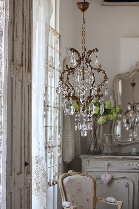
When I think of Shabby Chic light fixtures I think of tin, iron, and sparkling crystal tear drops.  The types of lighting range from ornate crystal chandeliers with swags to iron and glass pendants, and flower covered fabric shades to delicate sconces.  Sometimes the base is a detail looking like an urn or tea kettle with leaf ornamentation.

This style doesn't seem as valid as other styles throughout history.  Shabby Chic was a happy accident, not in response to a social or economic climate.  I know that Shabby Chic was popular during the 1990s, but that's about it...  So, I decided to do a little research.  Rachel Ashwell developed this style out of necessity.  She was a single mom with two young children, and needed a practical solution for her sofa.  Ashwell had white slipcovers made that she could throw into the washer as needed.  Suddenly her friends, and even celebrities, were seeking her out.  (Oh yes, this was in Los Angeles).  She opened her first Shabby Chic boutique in Santa Monica in 1989.  In an article from Inc.com, Ashwell says:

"A publisher asked me to do a book. I thought, What book can I do about a sofa? But it was the best decision I ever made. The book was about homes that relied on the Shabby Chic formula: cozy, comfortable, vintage, and pretty." ("How I Did It: Rachel Ashwell, Shabby Chic", Inc magazine, November 2011)

Ashwell's success rode the highs and lows of the economic waves around 2008, but she continues to have success with three boutiques in Los Angeles, New York and London under a partnership with Brand Sense Partners.  She also purchased a B&B she frequented when she was sourcing products in Texas, which is another great way to showcase her style. 

Well, my post today isn't about the infamous slipcover sofa, but let's take a look at the VINTAGE and PRETTY light fixtures in these Shabby Chic designs:


Bedroom with a simple perforated lamp shade


Crystal pendent with leaf detailing over a tea table, perhaps


A bit more shabby with chipping paint on this lantern over the dining table.


Fabric roses and lace adorn these white lamp shades- it's just pretty


Such romantic lighting in this foyer with crystal sconces and a tiered table lamp.


This elaborate crystal chandelier steals the show in this dining room


This style isn't for everyone, but I think we can all agree that Shabby Chic really gets to showcase a lot of sparkle in all of those crystal fixtures!


To learn more about Rachel Ashwell, be sure to visit her Blog and her online shop Shabby Chic Couture 


PS...If you missed my post last week, sign-up & GIVEAWAY, be sure to subscribe by email in the right column by Saturday, December 13th, at the strike of midnight!!  You will be automatically entered into the giveaway taking place next week.  Also, leave me a comment for which collection you would like in case you are a winner~


--------------------
SOURCES

General information: Inc.com


Sunday, December 7, 2014

mid-century modern LIGHTING


Mid-century lighting was out of this world!

The United States was looking past the sky, and into outer space.  It was the Cold War and the Space Race was in full gear.  President Kennedy shared that NASA will get a man on the moon.  The skies were no longer the limit, and the world was fascinated.  

"The exploration of space will go ahead, whether we join in it or not, and it is one of the great adventures of all time, and no nation which expects to be the leader of other nations can expect to stay behind in the race for space."  President John F. Kennedy, Moon Speech, Rice Stadium, September 12, 1962.

In a post-war society materials were also limited.  Scarcity triggered creativity and resourceful design.  Mid-century light fixtures have clean, geometric lines and forms.  Excess frills were left by the wayside.  Forms transferred into sculpture.  Lighting was a beautiful thing to look at, and still is!  Shapes were inspired by flying saucers, speed of space ships, hour glass, spheres, and rings like planets in space.


George Nelson and his Bubble Lamps, Interior Design Magazine 1952


1950's advertisement with a Bubble-lamp


Although this imaged looks a bit staged, it's still appealing over fifty years later.  The Bubble-lamp can mix with transitional styles as well because of it's simple form.


The Atomic light is a great focal point in this eclectic living room!  The fixture has a sphere at the center, and metal tubing radiates out in all directions.  Small bulbs burn bright at the end of each piece.  This should remind you of chemistry class when you learned about protons and neutrons.  Isn't it stellar?


This mini pendent was just too cute, I had to share it with you.  It looks like something that you would see at the Jetsons house, doesn't it?  

(This was designed by Louis Poulsen in collaboration with the Navy Buildings Department in the 1950s.  The design provided directional light, as well as a softer ambient light.  The Navy Pedant was discontinued in the 1980s, but has returned in updated colors for the 21st century, now called the Doo-Wop)


This task light just exudes speed...ZOOM!  It reminds me of a shuttle bursting into outer space.


Poul Henningsen (PH) worked with Louis Poulsen through the 1960s.  Henningsen designed the three shade system in 1925-26, but it fits perfectly into the mid-century modern style.  This system focused light to where it was needed- a task lamp.  Its directional light was ideal for rooms with high ceilings, or shown here for a dining room.  The fixtures were made of metal, and painted white on the underside (shown above.) Today, there are 19 options to choose from, including glass.


I hope you learned something new about a style that is favored by so many people today.  Most of you are probably familiar with this style from your childhood, thinking about your grandparents'  house, or even watching the popular show "Mad Men."

So, which Mid-century modern light fixture sparks your interest?


PS...If you missed the last post, sign-up & GIVEAWAY, be sure to subscribe by email in the right column.  You will be automatically entered into the giveaway taking place next week.  Then leave me a comment for which collection you would like if you are a winner~


--------------------
SOURCES

Mid-century design motifs: Collectors Weekly


Thursday, December 4, 2014

sign up & GIVEAWAY


December is the season of giving, so here's my giveaway~

Life gets so busy, it's easy to fall behind.  Well, I don't want you to worry about missing one of my 'missmatch' design ideas (that's no fun!).  So, all you need to do is move to the right hand column, and  enter your email address in the box under "follow by EMAIL" and click the Submit button. So easy, right?  

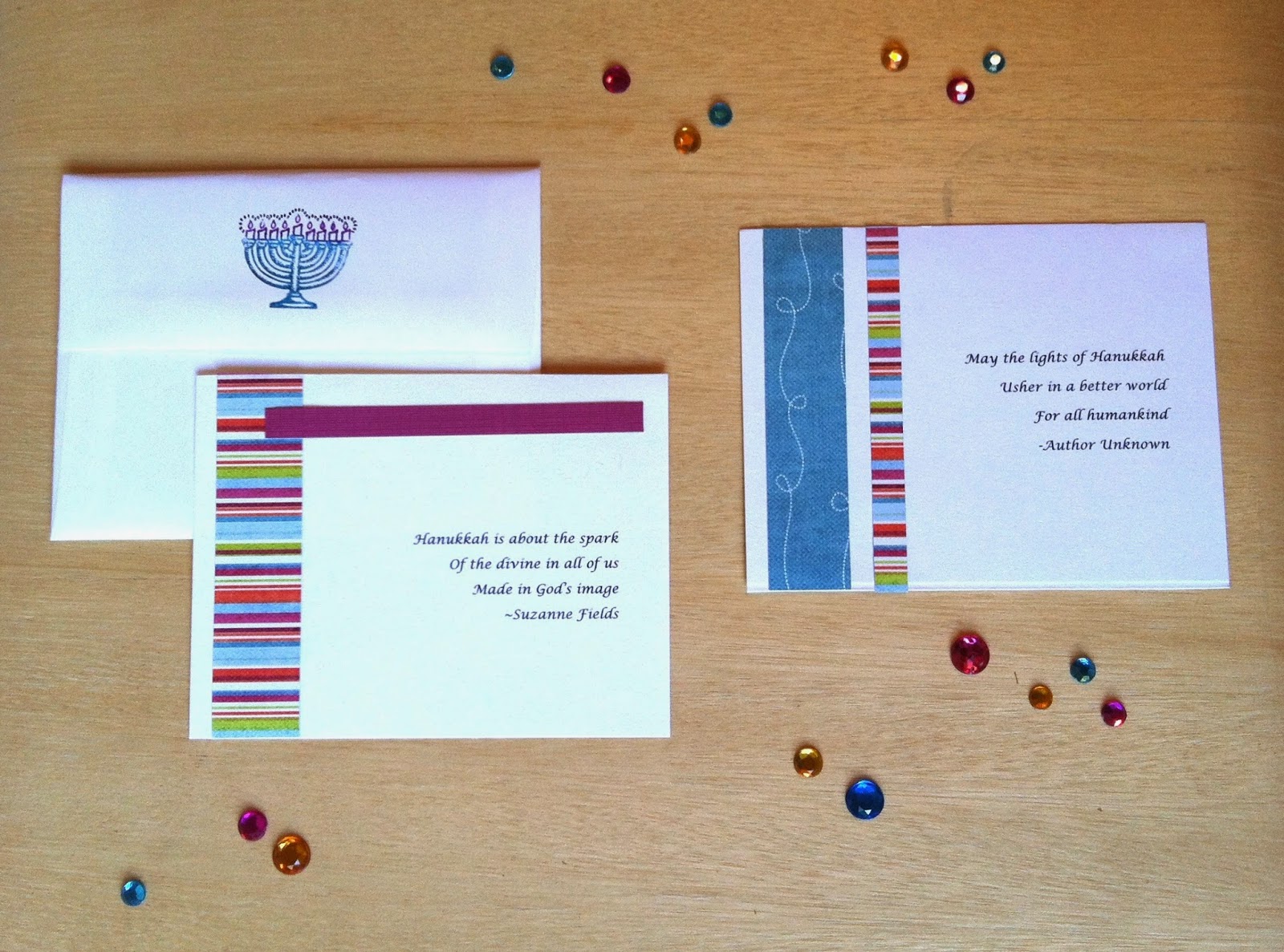
Not only that, but you will be automatically entered into my holiday card giveaway.  I will select 4 names at random to receive a set of holiday cards made by yours truly.  Below you will see I created 2 collections for Hanukkah and for Christmas. (Each collection includes 2 cards and 2 envelopes)

Entries will be added to the drawing until Saturday, December 13th at midnight, PST.


Collection 1: Get Striped Up for Hanukkah


Collection 2: Polka Dots and Latkes for Hanukkah


   Collection 3: It's Beginning to Look a lot like Christmas


   Collection 4: A Pretty in Pink kind of Christmas


Remember to leave a comment about which Collection or Holiday you prefer so I can match up the winners appropriately.

Winners will be announced in my post on Sunday, December 14th. 

I hope you'll subscribe and enter the drawing!!


PS...This is a great way to stay in the loop, especially if you are not following me on Facebook yet :)


-----------------


Monday, December 1, 2014

industrial & ethereal LIGHTS

Welcome to December!  (That means there's only one month until my birthday).

Let's see....December is about cold winter nights and sparkling lights.


I came across this pin on Pinterest about 6 months ago, and I fall in love with it each time I see in on my board statement PIECES.  They remind me of snowflakes falling from the sky.  Each piece is made of iron with a textile cord.   These geometric pendants are industrial, yet ethereal.  This collection is called Geometry Made Easy  by MIRCROmacro.  


Today I went to the MIRCROmacro website to see their other product lines.  Below is another featured collection called Con-Tradition.  These designs are inspired by the contradiction between contemporary materials and traditional Chinese forms.


Edison bulbs are the perfect lamp choice for these exposed fixtures- that last bit of sparkle.  The Edison bulb is clear with a visible filament.

I really appreciate the 'missmatch' design of these pendant fixtures.  One of the large fixtures would look like a piece of art in a foyer, casting shadows onto soft white walls.


--------------------
SOURCES

All images: MIRCROmacro
Related Posts Plugin for WordPress, Blogger...